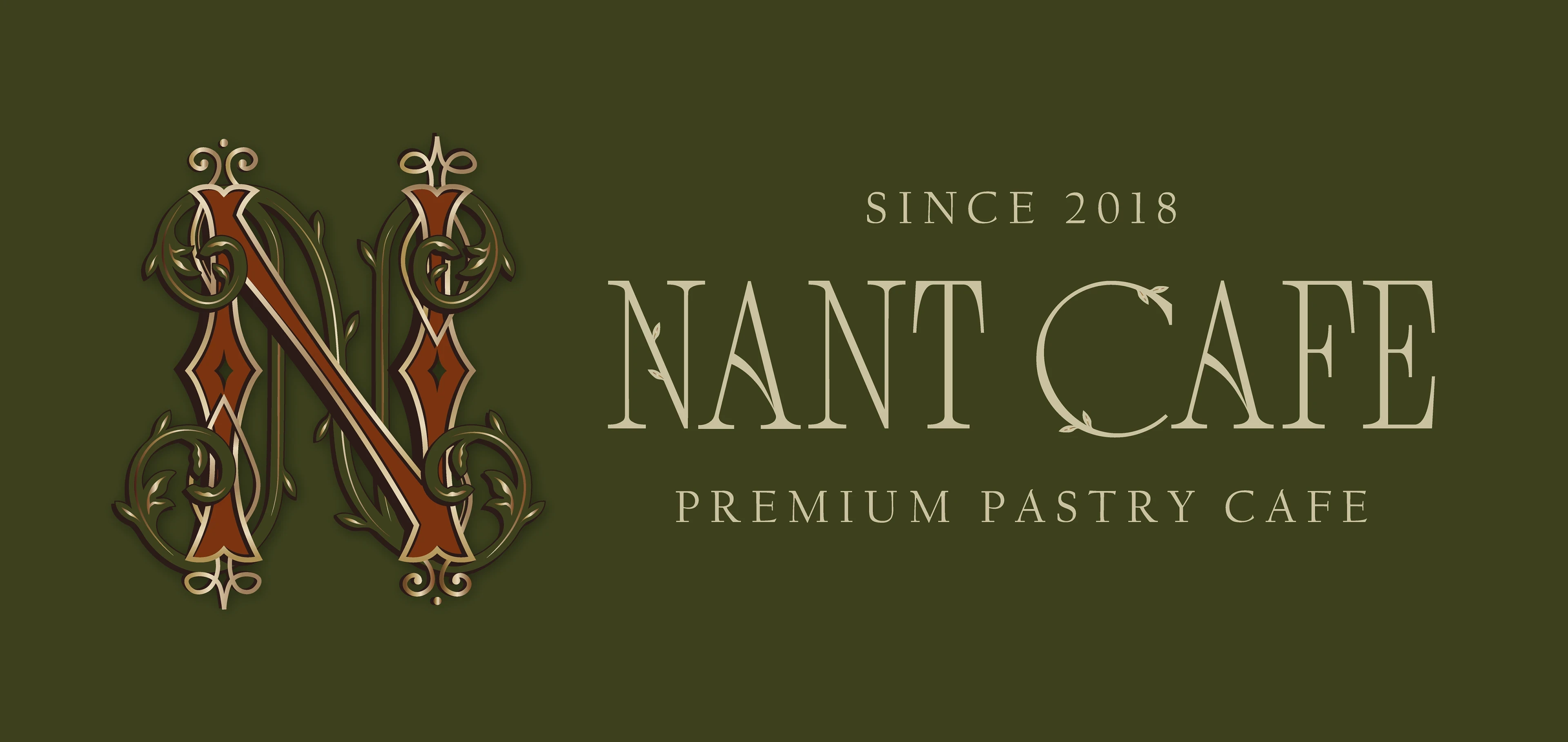
Nant
A refined and contemporary brand identity for NANT, blending minimal elegance with purposeful design to create a cohesive visual presence across touchpoints.
Nant
A refined and contemporary brand identity for NANT, blending minimal elegance with purposeful design to create a cohesive visual presence across touchpoints.
About
I developed a modern and minimal brand identity for NANT, translating the brand’s core values into refined and purposeful visual elements. This included logo design, color systems, typography, and brand applications across print and digital media. My focus was on creating an elegant and versatile visual language that communicates professionalism, clarity, and contemporary style.
Industry
Branding & Digital Experience
Branding & Digital Experience
Branding & Digital Experience
Branding & Digital Experience
Branding & Digital Experience
Type of work
Visual Design / Brand Identity
Visual Design / Brand Identity
Visual Design / Brand Identity
Visual Design / Brand Identity
Visual Design / Brand Identity

Challenges
Creating a visual identity that felt both minimalist and distinctive was the key challenge. The design needed to express sophistication and clarity without relying on overly complex graphics, while still making a memorable impression. Achieving this balance required thoughtful selection of forms, spacing, and visual hierarchy to convey both calmness and brand personality.
The process
I began with an exploration of minimalist visual language and brand positioning, iterating multiple logo and layout concepts. Through feedback sessions and refinement cycles, I narrowed designs that best reflected NANT’s desired tone. Careful testing across applications ensured consistency and visual harmony across all materials.


The outcome
The final brand identity reinforced NANT’s contemporary and elegant positioning. Cohesive visuals across logos, typography, and applications strengthened recognition and communicated a polished, modern aesthetic. The minimal design system ensured versatility and clarity across both print and digital formats, supporting a consistent and memorable brand presence.


